Friday, December 26, 2014

Mix100 tone hue shade tint

It is hard to believe that Splitcoaststampers is having it's 100 mixability challenge today. It is a challenge to play with tone hue shade and tint. THIS ARTICLE really helped me to define these terms and helped me decide what to do for the challenge. 

I took a bottle of paint called. "Laguna" it is a turquoise colored paint. I poured 4 puddles of the paint onto an acetate report folder. To one puddle I added white paint. To another I added black paint. and To still another I added both white and black and I left one puddle alone.  I took a piece of cardstock that I had printed a digital grunge paper in black and grays. I wanted to add the colors to this grunge paper but not in small brushstrokes, So I took a paper towel and dipped it into the puddles. I pounced the paint on a scrap piece first to get most of the paint off and to let the texture of the paper towel show through the paint. I did this with all four puddles of the paint.

This photo shows the painted grunge cardstock.


My good friend Debra gave me a butterfly stamp for Christmas. She knows how much I love butterflies. I love that it has script at the bottom of the stamp. I stamped it using black stazon ink. I watercolored the butterfly and greenery. I also watercolored the script. I tried to match the four colors on the background with my watercolor. To get the difference in watercolor you add more water to make it lighter instead of using white paint. When this panel was dry I went around the edges with a gold Sharpie metallic marker. I added gold fabric paint to the butterfly and I added  smooch to the four corners. I finished my card off with some black cardstock, gold thread and cheesecloth. 


Tuesday, December 23, 2014

Glitter Sisters

 This year has brought many blessings and surprises. One of the biggest blessings has been the friendships that have developed between the ladies on Mountain Plains Crafters. I was blessed to get to meet Terri in real life. These ladies are my crafting sisters. The other day, after talking about how we are crafting sisters, Jennifer said glitter is thicker than blood. I said we should make glitter cards in honor of our friendship. 
 I knew I wanted to make poinsettias on my card with red glitter. I was going to use red cardstock with red glitter,  But when it came time to get started,  I decided to use my encyclopedia pages with my die cut. I scribbled with tombow  liquid glue I sprinkled red glitter over the scribbles.
I used gold thread in my sewing machine to add some interest to the background and to add the  cheesecloth When I was done sewing I sprayed the whole card with gold shimmer paint. This photo shows how the gold shimmer paint looks on the black cardstock.


 I added Aleene's tacky glue to the center of the flowers and put some gold beads. 


The cheesecloth, drywall tape, and encyclopedia pages made a very non-traditional looking card, but I really like how it came together. Kind of like our friendship. We are all really different in our tastes and styles and experiences, but when we come together it just works. 


Check out what my craft sisters have made. HERE.

Friday, December 19, 2014

JOY Mixed media Ornament

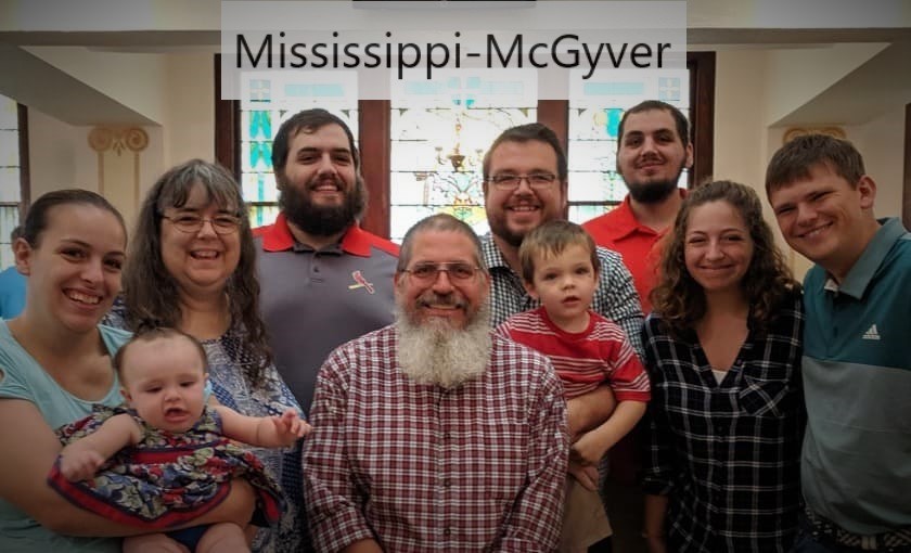
I have a really fun mixed media project to share with you today. I made a Christmas ornament to hang on my tree. The Splitcoaststampers Mixability challenge this week Mix99 was to take a photo and make a Christmas project that expressed ourselves. I took a photo that my daughter took last year of my wonderful family at our church's Christmas Eve service. I printed it in black and white on cardstock. I wanted it to look more than just a printed photo, so I sprayed the top of the photo with silver shimmer mist. I also added a little of gold shimmer mist too. 
Ok... a start then I was stumped. Looking at the supplies on my desk, the rest of the ornament just started taking on a mind of it's own. I took 4 popsicle sticks. I took some gray polka dotted fabric from ADORNit  BEPOP DOT GRAY and glued it to the popsicle sticks with hot glue sticks. I then sprayed the fabric with the silver shimmer mist. I tried to get it to photograph but it didn't pick up, but there is sparkles from the silver mist on the fabric. After gluing the fabric down there were still some rough edges. So I took some silver sparkle tape and taped over the edges. I took silver paint and painted the popsicle sticks where they showed behind the fabric.


I added two different types of lace one that was a cream color and one that was white. I liked the little bit of color the cream added to the project. I put pearls on top of the lace. I hot glued some cheesecloth before adding my photo that I matted with a piece of black cardstock. The alphabet beads were in a collection of plastic beads that my daughters had when they were little. When I was cleaning up the other day I saw them. I almost tossed them out, because I didn't see a use for them. I'm glad I didn't toss them because I think it is the highlight of my project. (Why I have such a hard time parting with my junk.) The word "JOY" describes me and my family. A long time ago a friend told me what JOY stood for. JESUS, OTHERS and YOURSELF. That is what I see displayed in the lives of my family. I attached the letter with wire that I curled around a chopstick and hot glued at the ends.


Then it was time to do the backside of my ornament. I printed this scripture digital image from Diane;s Daydream Designs called THE GLORY OF CHRISTMAS SENTIMENT SET.
I printed it on white cardstock. I also printed the grunge paper behind it on the same piece of cardstock. I sprayed it with the silver shimmer mist.  I framed the scripture with a piece of black cardstock. I added another piece of lace and brads before hot gluing this side down to the popsicle sticks. I added more wire on this side to hang the ornament. I added a sheer ribbon bow at the top with more hot glue.


Here is it hanging on my tree.


 I hope as the last few days before Christmas come rushing by, that you have time to stop and reflect on Jesus because he is the real reason we celebrate.

Monday, December 15, 2014

A dirty girl


I have exciting news. I have been chosen to serve a term on Splitcoaststampers.com as a Dirty Dozen designer. It is such an honor to be chosen to do this. I will be able to share my projects after my term ends. I am so thankful for the support from my family and friends.

Wednesday, December 10, 2014

Holiday Coffee Lovers Blog Hop- JAVA TIME


This is my card for the Holiday Coffee Lover's Blog Hop.

Make sure you check out the blog hop HERE.


I had a lot of fun making this card.

I used a stamp set from MFP called JAVA TIME

I wanted my card to feel like I was in a small coffee shop, with snow falling outside. I took dp that had a distressed brick design. I took the coffee ring stamps from the set and stamped them with brown ink the corners of the paper. The paper was sprayed with a silver sparkle mist. It was hard to photograph but there are little specks of silver on the dp.  I matted the dp with gray and brown cardstock. 


I used my sewing machine to attach the dp and mats to the base of my card.I cut a paper doily in half to make my table cloth. I sewed it to the base of the card too. I  sewed a gathering stitch to my cheesecloth and then sewed it to the base. I wanted to leave the bottom free so it would look kinda like a curtain. This next photo shows how the cheesecloth hangs free and has movement.


My favorite part of my coffee card is my hand made quilled snowflake. I took pieces of cardstock that I had cut 1/8 of an inch thick. I quilled them, added pearls and glue and glitter. It is hard to see in photographs just how sparkly this snowflake is in real life.


I made my card into an easel card. I added brads to make it stand up. I stamped the sentiment from the set on the bottom of the easel. The coffee cup was done with a maroon marker and a silver marker. I took white paint to add the highlights. I finished my card off with a pearl flourish for the steam from my cup of coffee.


Friday, December 5, 2014

Mixability inchie love.


The mixability challenge this week is to use several inchies or twinchies on a card/project. I choose to go with inchies. I started with the one on the left. I am not a big tape user, but when I saw this sparkly gold tape, I had to get it. I added a piece of paper doily, some pearls and I free hand cut the hearts.


\

My second inchie was the blue and silver one. I had a scrap of cardstock that I had used markers and an embossing folder to make the blue squares. I added some cheesecloth for texture. I added silver marker around the edges. I added rhinestones and punched out hearts.


The third inchie I made was from a scrap of faux barn board. I punched the barn board so that the brown mat would show through. I added some drywall tape and used Inka gold copper metallic rub over the drywall. It didn't want to stay on the barn board so I added two pewter brads that I added copper marker to the top. I like adding the marker to the brads because it kinda looks antique.


Using a digital image from Diane's Daydream Designs. I used SENDING YOU LOVE OUTLINE SET
I printed it on white cardstock. I added the sentiment "Sending you love."  I also added to the left side and bottom the word love in different languages.
These two photos show the "love" around the edges.


 After I printed the postcard, I took tea bags to age it. I heated the cardstock to make it really dark. Then I sprayed it with gold shimmer ink. The ink kinda puddles and splattered. I made little envelopes to hold my inchies. I added more texture and interest by sewing with gold thread around the edges of the card.